Improve Your Website with Web Analytics: 5 Important Metrics
Your nonprofit collects data all the time, from supporters’ communication preferences to their giving habits, demographics, and more. You probably use this information to enhance your fundraising and marketing campaigns to better appeal to supporters’ interests. Did you know you can also use data to help improve your website?
Website data gathered from sources like Google Analytics, along with donor data from your nonprofit’s CRM, can be used to develop a website that speaks to your audience and drives engagement. We’ll review these five specific metrics that can help you design a better website:
You can gather and assess this information on your own, or turn to a nonprofit web design professional to help translate your data into actionable insights. Either way, using your data to make informed web design decisions will pay off in the long run when you can generate more online support.
1. Donation page metrics
Your nonprofit’s online donation page is the tool that turns casual website visitors into supporters. Understanding where your donation page is succeeding and where it’s missing the mark can help you make informed design decisions that boost your online fundraising results.
Here are a few of the most essential donation page metrics to keep an eye on:
- Click-through rate: This is the percentage of website visitors who click on the link to your online donation page. You can boost your click-through rate by developing more enticing calls to action (CTAs) or by featuring your giving page more prominently on your website’s homepage or main menu.
- Conversion rate: This metric measures the percentage of people who visit your online giving form and actually donate. To improve your conversion rate, Kanopi recommends emulating the top nonprofit websites by making the giving process as straightforward as possible. Keep the design simple and uncluttered, use a clear and consistent tone, and make the page mobile-friendly.
- Average online gift size: Compare this metric to your average gift size for other channels like direct mail. If your average online gift size is lower than expected, you can try to increase it by offering higher suggested donation amounts or giving donors the choice to cover additional processing fees.
By using data to inform your donation page design strategy, you can increase online conversions and turn your website into a more effective fundraising channel.
2. Demographic data
Knowing more about your supporters’ backgrounds can help you design a website that resonates with them. When it comes to managing and tracking donor data, your CRM is your most powerful tool. Use your CRM to track demographics that are meaningful and applicable to your organization. Those could include:
- Age
- Gender
- Ethnicity
- Employment information
- Education level
Consider this data when redesigning your website to better appeal to as many audience members as possible. For example, if you discover many donors work for companies that offer matching gift programs, you can better highlight matching gift opportunities across your website and online donation page.
If your CRM is missing critical demographic information, you can conduct a demographic append to add extra details. A demographic append pulls information from third-party databases to help you fill gaps in your supporter information.
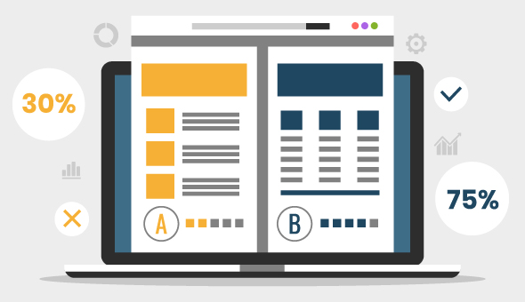
3. Split testing results
Let’s say you’re looking to redesign your nonprofit website’s menu but you aren’t sure what type of navigation will work best for your audience. You may currently have a vertical sidebar menu but want to find out if horizontal navigation will work better.
To determine the best path forward, you can carry out a split test (also known as an A/B test). You’ll create a new web page with a new URL that is identical to the original page but features a horizontal menu instead. Then, you’ll show both versions to similar audiences to gather feedback about which version performs better.
Here is an example of what that A/B test might look like, with click-through rates shown for both menu options:
In addition to your menu design, you can also conduct split testing for:
- Images
- Videos
- Calls to action (CTAs)
- Headers
- Colors
- Typography
You can assess practically any web design element with split testing to determine which options are more appealing to your audience. Through this evaluation, you can make informed decisions rather than acting on hunches.
4. User behavior metrics
Different aspects of your website will naturally be more engaging than others, whether it’s your image slideshow, homepage video, or audience polls. You can determine exactly which page elements are most engaging by running a user behavior analysis.
Using a website heatmap tool, you can understand how visitors engage with your website to determine opportunities for improvement and proactively identify user experience issues.
Look into popular options like HotJar or explore the options available through your CMS. Drupal and WordPress both offer modules and plugins to conduct heatmap analysis in real-time.
Combine insights from a heatmap tool with Google Analytics to reveal the following metrics:
- Time on page. Determine how long visitors spend on each page before clicking away.
- Mouse tracking. See which buttons visitors click, how far they scroll down each page, and what areas of each page they ignore or engage with most.
- Direct user feedback via surveys. Incorporate website polls using feedback widgets to gather direct audience input.
These user behavior metrics can help you collect data for your split tests, making it easier to determine the best path forward for your design choices.
5. Traffic sources
Your website’s data can also reveal the success of your multichannel marketing efforts. By assessing your most popular traffic sources using Google Analytics, you can see which marketing channels drive the most cross-platform engagement.
Google Analytics groups traffic sources into the following categories:
- Direct: typing your website’s URL into a browser
- Referral: clicking a link to your website from another website
- Social media: clicking a link to your website from a social media post
- Email: clicking a link to your website from an email
- Organic search: clicking a link to your website from a search engine
- Paid search: clicking a link to your website from a paid search ad
Using this information, you can maximize your efforts on your most popular channels and build up outreach on other important channels that are underperforming.
For example, you might determine that your organic search traffic is thriving due to your robust SEO strategy, but your paid search ads could be more visible. In this case, you might consider applying for a Google Ad Grant. This program offers qualifying nonprofits $10,000 per month to spend on Google Ads, which are the paid search ads that appear at the top of search results pages.
Getting Attention’s guide to Google Ad Grant optimization recommends taking specific steps to make your paid search ad strategy more effective. These include using specific, long-tail keywords, targeting local audiences, and creating user-friendly, informational landing pages on your website.
Develop a process for continually reviewing these metrics with your nonprofit’s team. Practice good data hygiene by keeping your donor database and reporting processes organized and consistent. This will allow you to adapt to new audience preferences or trends to continue improving your website and appealing to supporters’ interests.


